Anastasiia Sichkar
Yora. Mobile app for reading serialized stories — episode by episode.
-
Role
Senior UI/UX Designer — solo, end-to-end
-
Period
Sep 2025 — Feb 2026
-
Platform
Mobile app — iOS & Android
-
Scope
Structure, user flows, all app screens, UI-kit

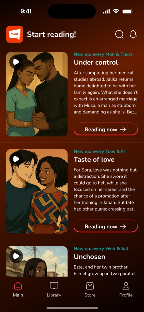
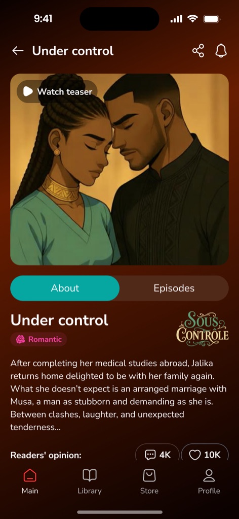
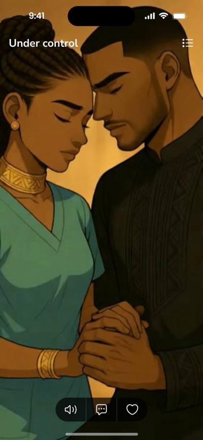
Yora is a reading app for romantic and drama series released episode by episode. Readers discover stories, read for free or with an in-app currency, save favorites, read offline and discuss episodes.
-
Challenge
Make it simple to start reading, keep readers coming back for new episodes, and explain the monetization — Cowries, packs and subscriptions — clearly.
-
Result
Complete app design from onboarding to profile:
50+ screens, 7 flows, a reusable UI-kit, handoff to development.
Six flows that make the app.
-
01
Onboarding
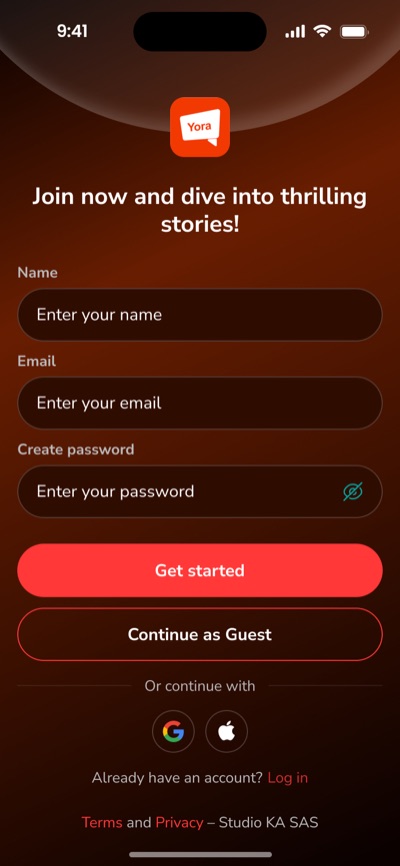
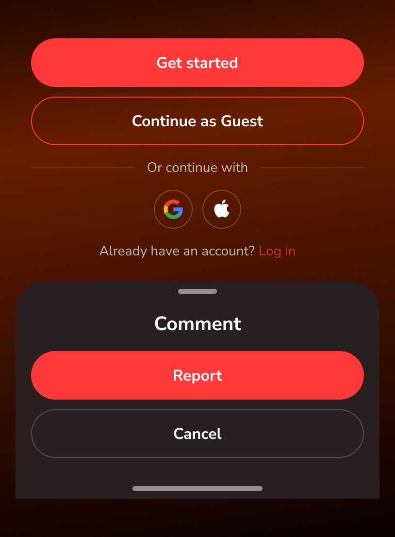
Intro video, “first two episodes are free”, short sign-up, choice of language and region.
-
-
02
Discover & Read
Featured series, series page with teaser, episodes list with free / paid states, and a distraction-free reader.
-
-
03
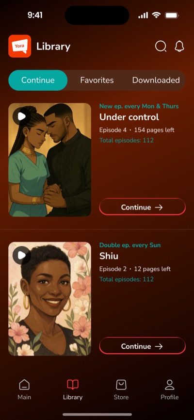
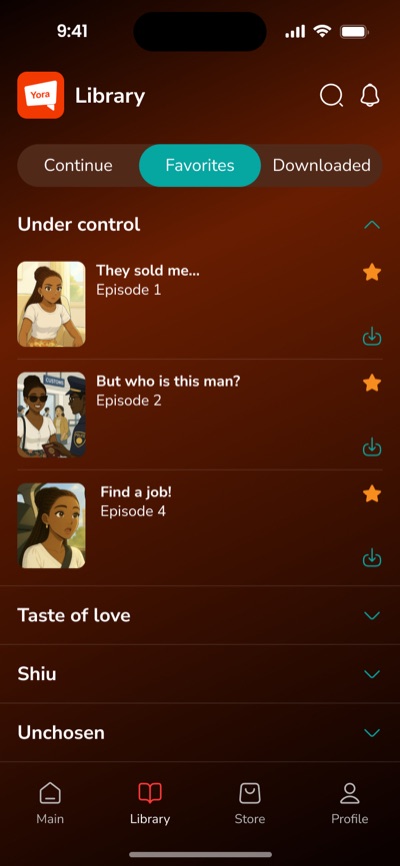
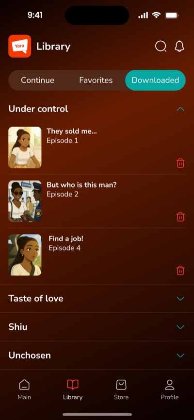
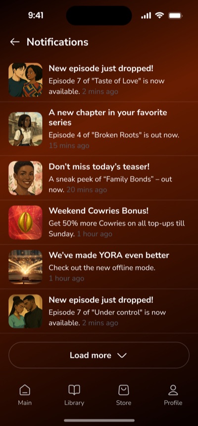
Library
Continue where you stopped, favorites, offline downloads and new-episode notifications.
-
-
04
Monetization
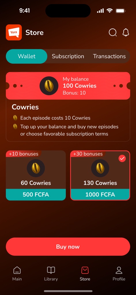
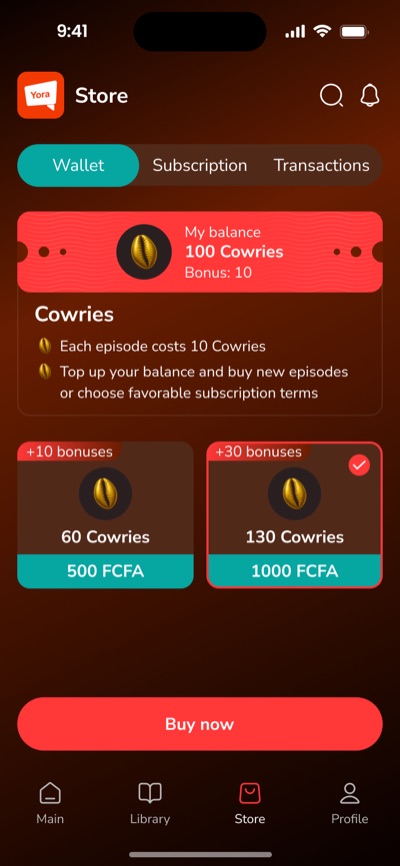
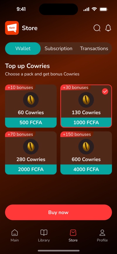
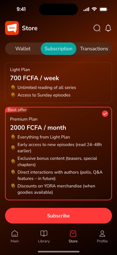
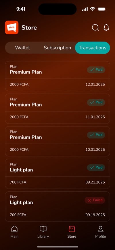
In-app currency Cowries with bonus packs, Light and Premium subscriptions and transaction history.
-
-
05
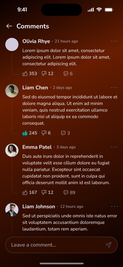
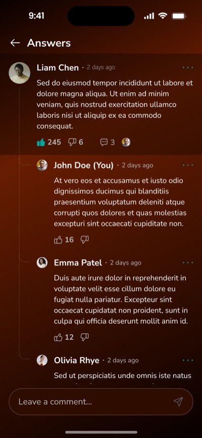
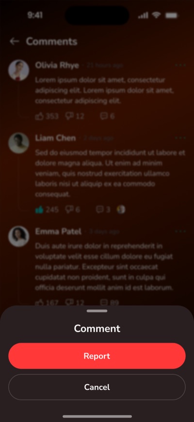
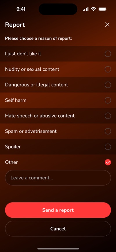
Community
Comments and replies under episodes, plus a report flow to keep discussions safe.
-
-
06
Profile & Settings
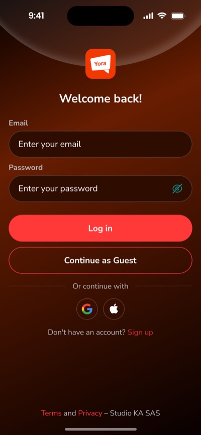
Account, avatar, dark mode, downloads over Wi-Fi only, contact form and account deletion.
-
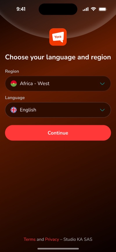
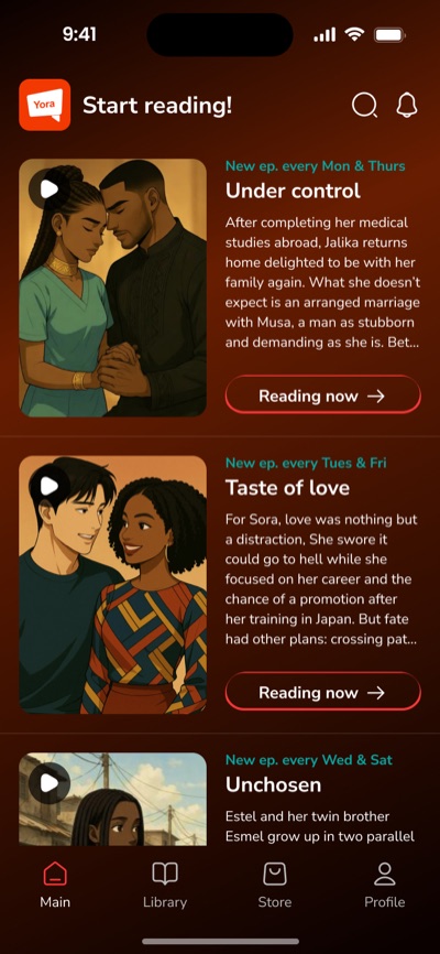
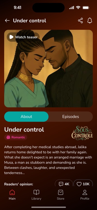
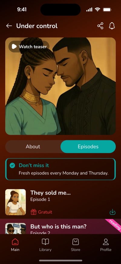

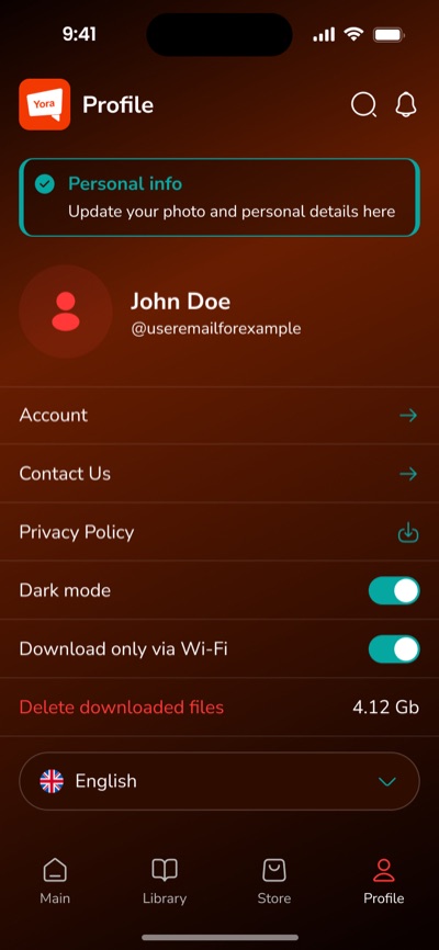
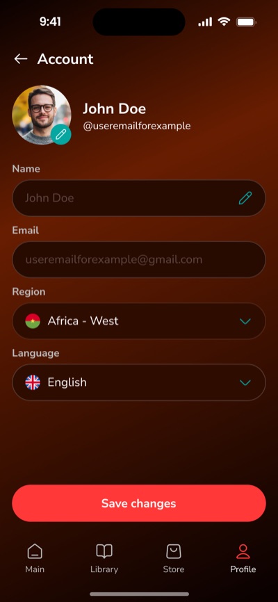
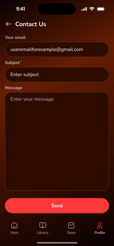
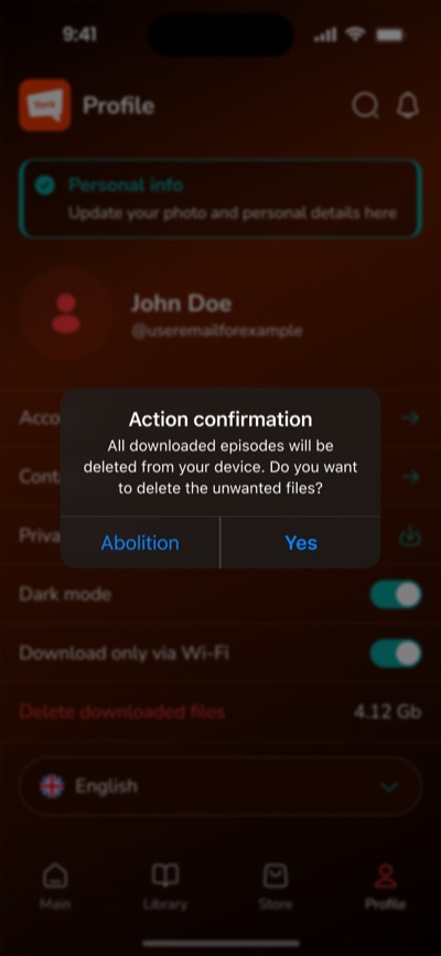
Reusable elements behind every screen.
-
01
Navigation
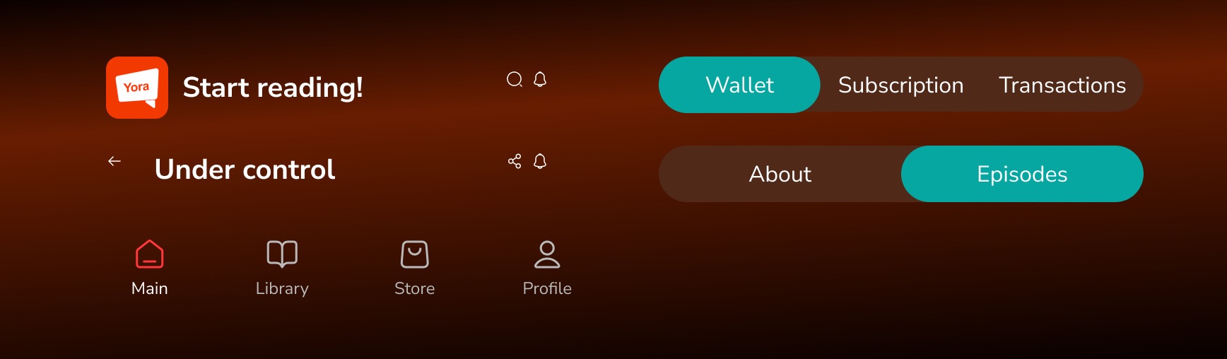
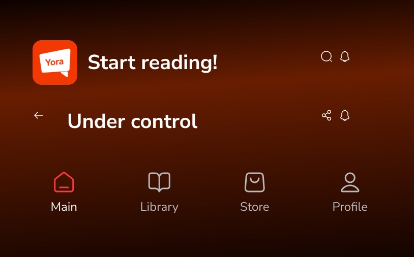
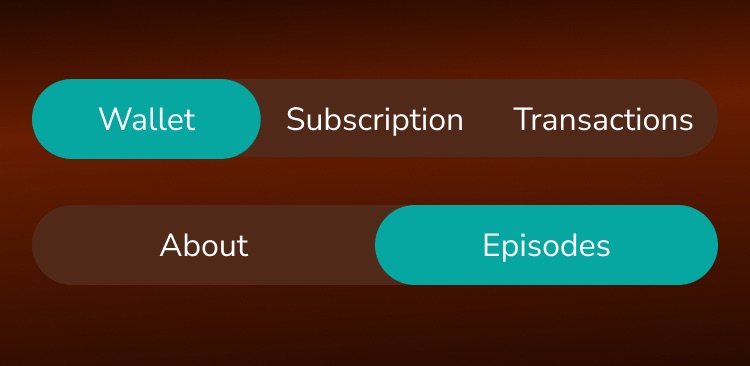
Tab bar, page headers with actions, back navigation and segmented tabs.
-
02
Content
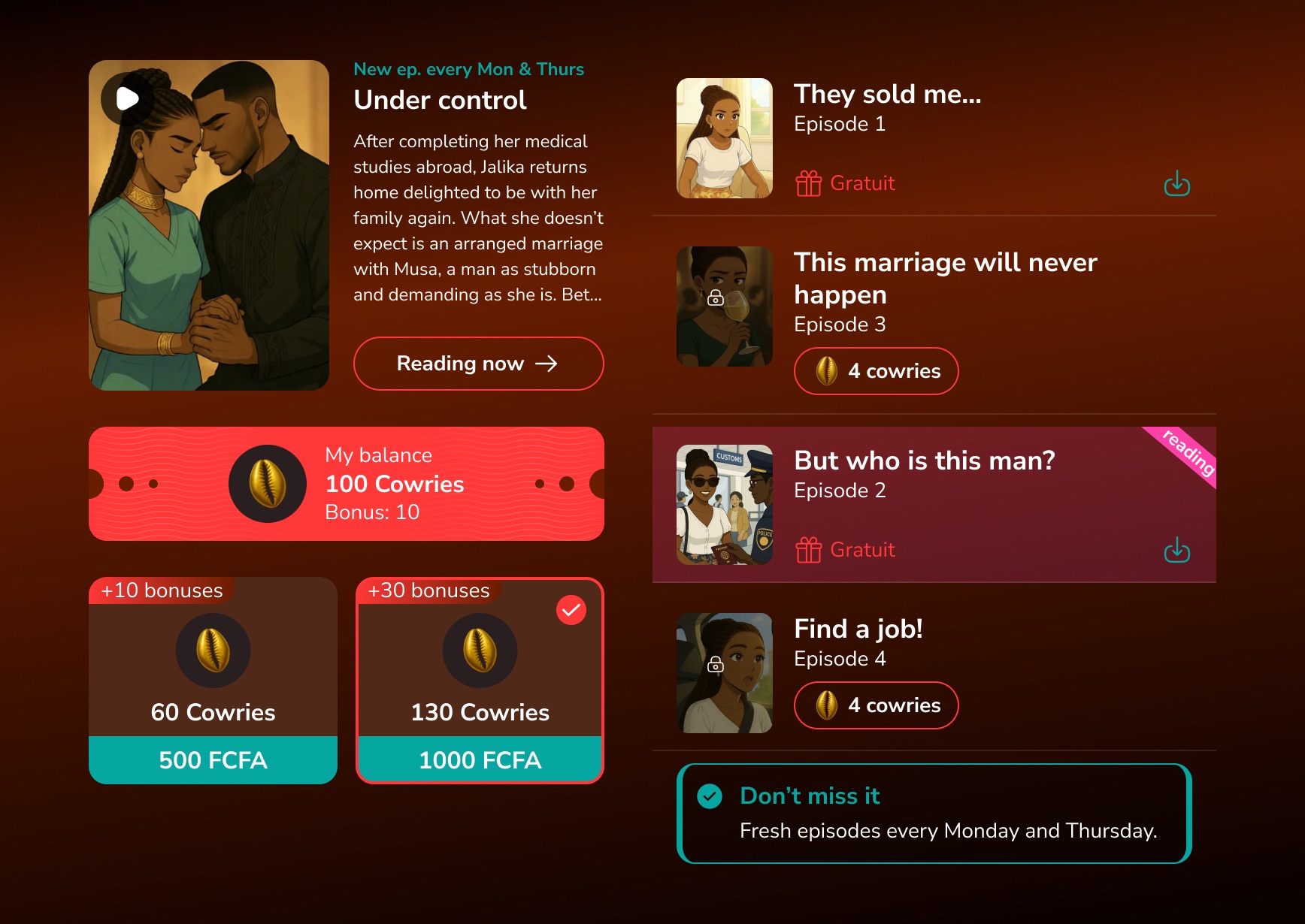
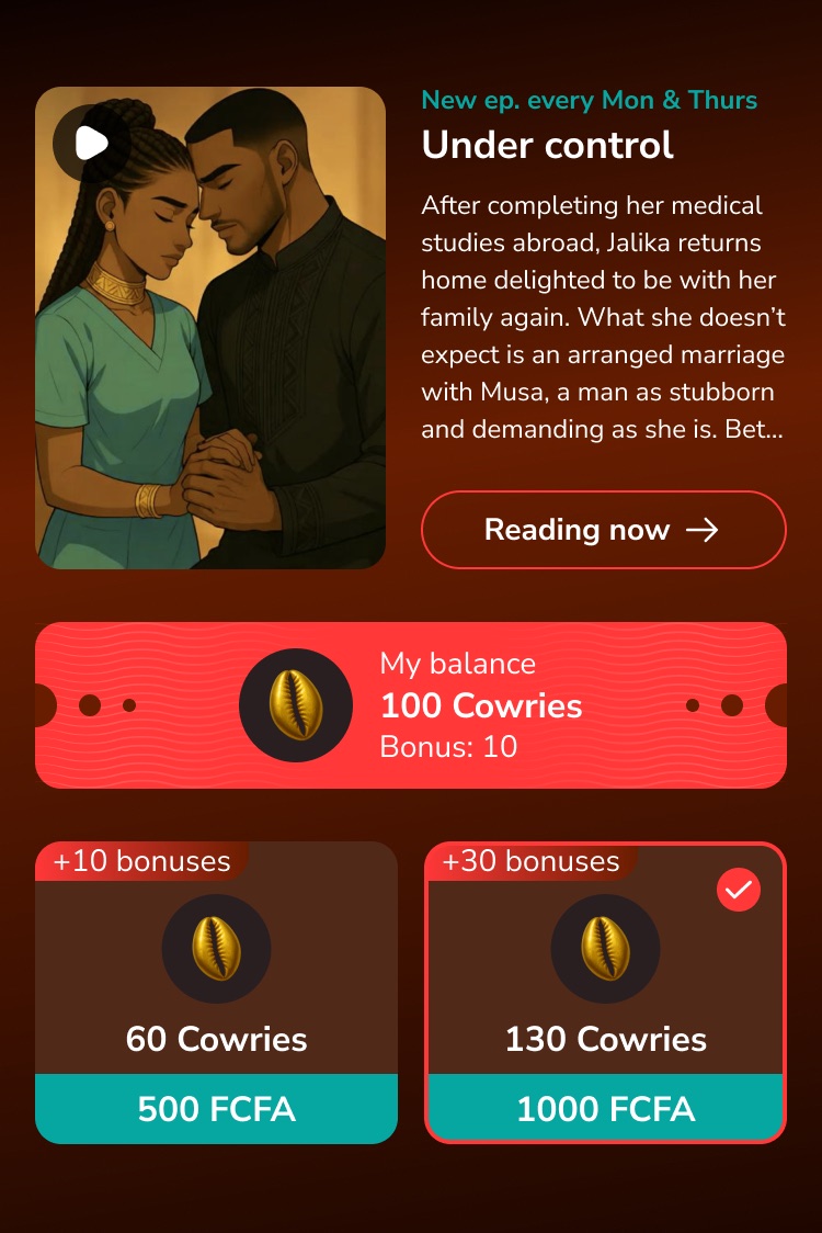
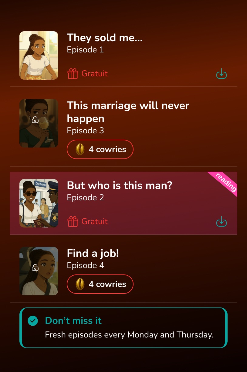
Series cards, episode rows with free / locked states, balance and Cowries packs.
-
03
Actions & states
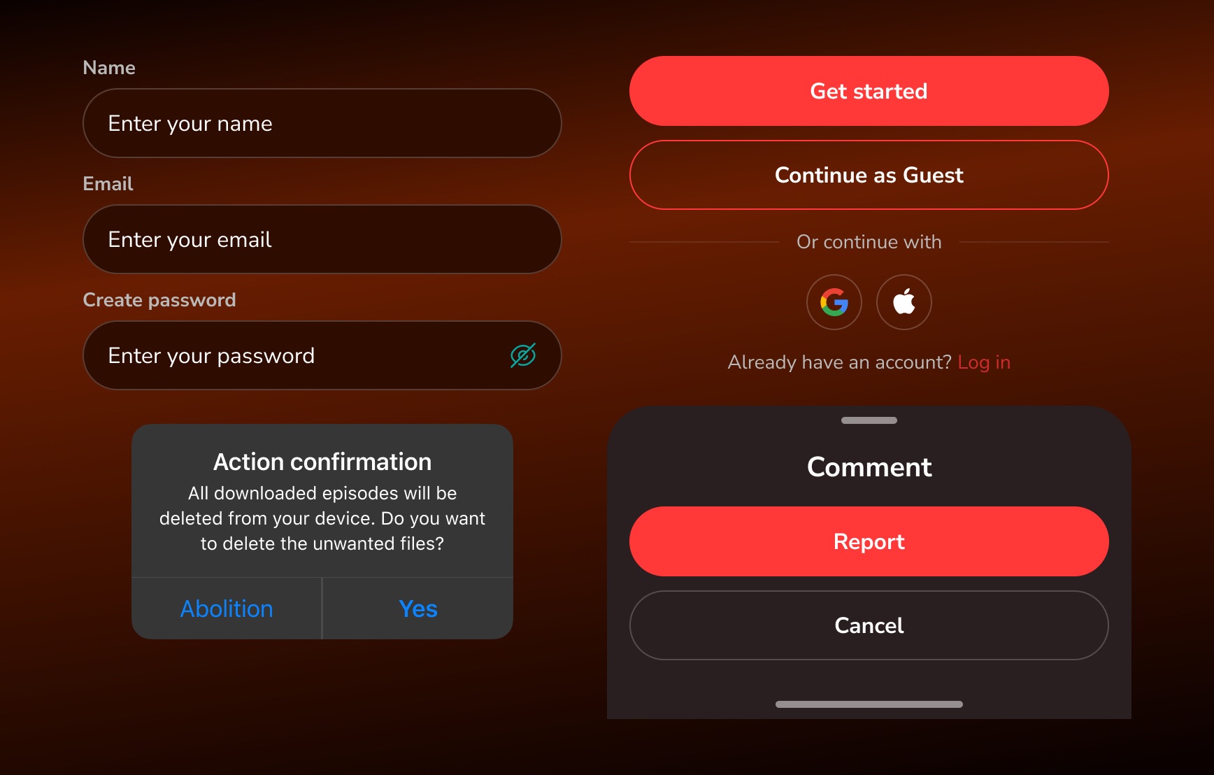
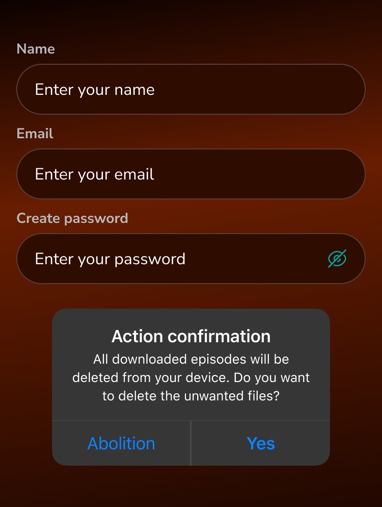
Form inputs, primary and secondary buttons, social sign-in, alert and bottom sheet.
What this project gave me.
-
Mobile-first thinking
Designing for one hand, short sessions and offline use.
-
Monetization UX
Making currency, packs and subscriptions easy to understand.
-
End-to-end flows
From the first launch to account deletion — every state covered.